I like the sepia too! I think the black and white is good, but sometimes sepia just does the trick. I like how you did the pictures this week. Very cool!
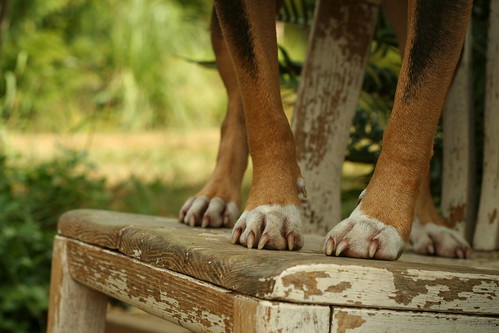
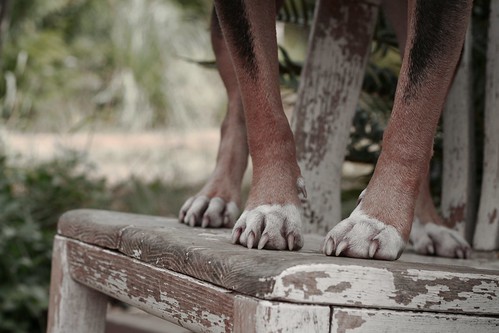
I like the heavily de-saturated version best. There's enough warmth to the image to make it pleasant and tell a story, but enough softness that the color isn't distracting. I think the original has too much yellow hue to it and the b/w doesn't hold enough interest. The sepia is nice, but I think the original hues toned-down are much nicer.
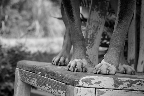
I agree with Dom, too much yellow in the original. The mild de-saturation is lovely and suprisingly emotion evoking for me. It reminds me of the cover of some classic novels I have. It looks like it's from the "To Kill a Mockingbird" era. The strong de-saturation is just one step too far; not bad, but not good either. Black and White is dull and lifeless. The wood becomes more important than the dog's lovely legs. And sepia is just not right. There isn't enough contrast.


Top one :-)
ReplyDeleteI like the sepia! :)
ReplyDeleteI like the second best!
ReplyDeleteNola
I like the sepia too! I think the black and white is good, but sometimes sepia just does the trick. I like how you did the pictures this week. Very cool!
ReplyDeleteI like the heavily de-saturated version best. There's enough warmth to the image to make it pleasant and tell a story, but enough softness that the color isn't distracting. I think the original has too much yellow hue to it and the b/w doesn't hold enough interest. The sepia is nice, but I think the original hues toned-down are much nicer.
ReplyDeleteMom likes full color and Sepia
ReplyDelete~Mason
I too, love the sepia! The desaturated photographs evoke a mood better I think than the distractions in a colour photo.
ReplyDeleteWoof! Woof! COOL! we like the some de-saturation photo. Happy BW Sunday. Lots of Golden Woofs, Sugar
ReplyDeleteI like the second one the best. Looks old-timey.
ReplyDeleteThe sepia is my favorite!
ReplyDeleteI love the first one. Something crucial gets lost in the black and white one.
ReplyDeleteSome de-satuation.
ReplyDeleteI agree with Dom, too much yellow in the original. The mild de-saturation is lovely and suprisingly emotion evoking for me. It reminds me of the cover of some classic novels I have. It looks like it's from the "To Kill a Mockingbird" era. The strong de-saturation is just one step too far; not bad, but not good either. Black and White is dull and lifeless. The wood becomes more important than the dog's lovely legs. And sepia is just not right. There isn't enough contrast.
(Sorry for the long opinions)
second
ReplyDelete